

What do you get when you combine masterful design, concise info, creativity and meaningful stats? The all-powerful, brain-delighting, popular infographic — an ideal visual format for social media sharing that is easily consumed by energy utility customers and a great way to explain complex topics.
Infographics are a big part of today’s content marketing landscape. Subscribe to any business or special interest digital newsletter, and you’ll likely see an infographic. These data visualizations tackle nearly all topics in every industry.
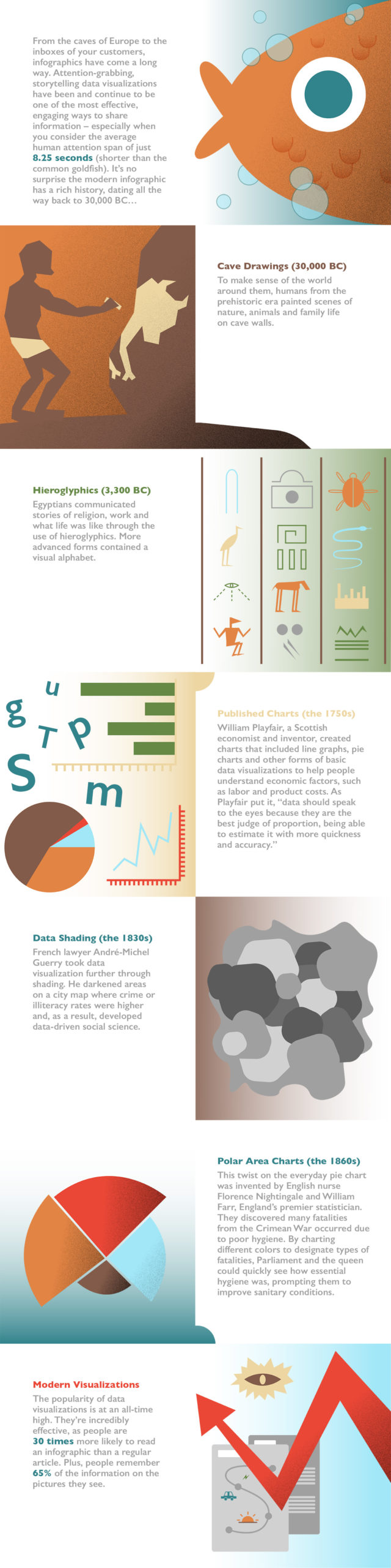
Their popularity among readers continues to grow. The competition for digital mindshare is fierce and attention spans are at an all-time low. Studies show the human attention span has, on average, hit 8.25 seconds — shorter than the common goldfish.
Infographics are designed to catch your eye. Many of them do. But to keep that attention, they must clearly and creatively convey key information.
Before we dive into what makes today’s infographics popular, let’s look at where it all started. The very first infographics were, more than likely, found in early human dwellings. You guessed it — we’re talking about cave drawings. Design experts believe the earliest examples of the art form can be found on prehistoric cave walls from 30,000 years ago, when early humans painted scenes featuring animals, nature, family life and more.
Ancient Egyptians’ well-known hieroglyphics, which visually depict stories of religion, daily life and work, are considered by many to be early forms of infographics. The later, more sophisticated Egyptian hieroglyphics combined a visual alphabet that formed word pictures — artful, visual communications that have stood the test of time.
As we fast forward to the 1700s, infographics are discovered in the forms of charts, graphs and even maps. Many of those look a bit like basic infographics of today. In this era, we see typography beginning to take on a central role in design.
In the 1750s, William Playfair, a Scottish inventor and engineer, is reported to have invented and published charts that included line graphics, pie charts, graphs and other forms of basic data visualizations to help people understand economic factors such as taxes, labor and product costs. As Playfair put it, “Data should speak to the eyes because they are the best judge of proportion, being able to estimate it with more quickness and accuracy.”
In an article by Kelsey Campbell-Dollaghan, she explained, “Before Playfair’s time, words and drawings were two distinct ways of communicating that rarely converged. But as the burgeoning Enlightenment gave birth to modern science and the first traces of the Industrial Revolution, economists, engineers and historians found a need for a new language: One that could quantify data visually.”
French lawyer André-Michel Guerry took data visualization further in the 1830s through shading. He darkened areas on a city map where crime or illiteracy rates were higher and, as a result, developed data-driven social science.
Even the mother of modern nursing helped shape modern infographics. Polar area charts, a twist on the everyday pie chart, were invented by English nurse Florence Nightingale and William Farr, England’s premier statistician. They discovered many fatalities from the Crimean War occurred due to poor hygiene. By charting different colors to designate types of fatalities, Parliament and the queen could quickly see how essential hygiene was, prompting them to improve sanitary conditions.
Today’s infographics combine actionable data insights with striking visuals to catch attention and encourage engagement. In fact, people are 30 times more likely to read an infographic than a regular article. Plus, people remember 65% of the information on the pictures they see. As we continue to seek new ways to distill complex information into easy-to-consume stories, infographics will undoubtedly be a driving force in the future of marketing and communications.
Sources: Brain Rules, Branch Collective, Gizmodo, HubSpot, NeoMam, Smithsonian Magazine, Visually.